Government officials are exploring how to demonstrate a school’s inclusivity within its community.
This could form part of new “school profiles”, aimed at providing parents and the public with “clear, reliable information”.
What data exists on inclusion and what should ministers consider? Schools Week investigates…
The Labour government came in with a mission on SEND – to make mainstream schools more inclusive. Measuring that isn’t always easy.
The previous government shelved plans to include contextual information in league tables showing inclusivity of mainstream schools after “mixed feedback” suggested it would “risk generating perverse incentives”.
Raw data on the number of pupils with education, health and care plans, for example, can be problematic. A low number could suggest that a school offers effective support without the need for education, health and care plans (EHCPs).
Considering the rates within the community can provide insight. However, Professor John Jerrim, at University College London, said establishing the areas to explore is “tricky”.
“Catchment areas vary by school and change over time,” he said. “You could use other geographic classifications but schools may be on the boundaries. So it’s not a straightforward issue.”
Online inclusion tools
Researchers have tried capturing the wider context of schools in recent years.
The Education Policy Institute’s (EPI) inclusion tool allows users to compare school groups – councils and academy trusts – based on more than a dozen measures at primary and secondary level.
It scores the likelihood of a local pupil who is disadvantaged or has SEND being admitted into the trusts’ schools. In this context, they define a school’s local area as where 90 per cent of its pupils live.
Other metrics offer context, such as teaching assistant turnover and whether the trust is operating a deficit.
The EPI found last year that trusts with 10 or more schools had, on average, higher rates of persistent absence, suspension and unexplained exits than smaller multi-academy trusts (MATs) and councils. However, they admitted more disadvantaged pupils and achieved better outcomes for those youngsters.
Jon Andrews, the EPI’s head of analysis, said the tool was something they “thought long and hard about,” including consulting with the sector on what the measures should look like.
However, the data is several years out of date. Group data may also “mask” individual school practices across a group.
While Andrews thinks the tool is a “good blueprint” for DfE, there are “limitations of data” and it shows “just one part of the picture”.

FFT Education Datalab created an online “school quality index” for secondary schools. Dave Thomson, its chief statistician, said because inclusion meant “different things to different people”, its approach was to draw up a list of factors.
It created a hypothetical area around the school. So for example, if a school had 180 pupils in year 7, the area consisted of the nearest 180 state school children of year 7 age.
It looked at the percentage of disadvantaged pupils, pupils with a first language of English who recently arrived, pupils with EHCPs on roll compared to the area, and joiners and leavers, absence and suspensions.
It considered “contextualised” attainment 8 scores for vulnerable pupils.
Schools were given inclusion and attainment scores out of 100. It gave the school a ranking out of all eligible schools.
However, Thomson said it was “restricted” to measures available in public datasets or the national pupil database in 2023.
“In an ideal world, we would widen it to include other measures for which national data does not yet exist, for example measures of pupil wellbeing,” he said.
Admissions data was a focus used by Comprehensive Future and the National Secular Society to analyse which secondaries have the biggest “inclusivity gap”.
Their study mapped secondary schools against surrounding primaries, weighting closer schools more heavily. They compared the school’s disadvantaged pupil intake with the mix of surrounding primaries.
Where the school’s intake was less representative of nearby primaries, they labelled this a “gap”. They then explored the 200 “least inclusive” schools to check their admissions policy. Thirty-eight per cent were faith schools – including nine grammar schools that have religious foundations.
In response, the Church of England said most of its schools had “no faith selection criteria”.
Paul Barber, Catholic Education Service director, said Catholic schools had 10 times the catchment area of other schools, so were less reflective of their immediate locality.
Councils begin their own work
Consultants working on the “change programme” – which is testing SEND reforms – found “bringing data together and using it across services is a sign of a well-developed local system”.
To improve mainstream inclusivity, “more work is needed to agree on the most important measures”, according to an “insights guide” from the programme’s first phase. This should link to “long-term data on local needs” with “real-time operational data”.
The change programme tested a prototype inclusion dashboard, proposed by the previous government, with metrics on education, health and care.
However, many councils felt the data they were already using locally was “more detailed, relevant and timely to support operational and commissioning decisions”.
Some areas were concerned a new national platform “might not keep with their own” dynamic data tools and dashboards.
In Islington, council officials created an “equity toolkit” for primary schools. It consists of three elements: metrics, survey results and a self-evaluation checklist.
The metrics include outcomes for disadvantaged pupils and “inclusion” measures, such as suspensions and exclusions for vulnerable children and leavers. It looks at community engagement, so the percentage of family responding to school surveys and attendance at SEND reviews.
Annual surveys of children, parents and staff are completed. There’s an “inclusion readiness checklist” for heads. Schools are benchmarked against each other and compare themselves with similar schools. It’s not mandatory for schools to take part – all have.
Candy Holder, education and achievement co-director, said the approach gives schools a way “to tell their inclusion story”.
But she said it was not about “blame or finger pointing”: “We ought to be helping those schools who may be less further on with their [inclusion] journey. It’s about collaboration over competition.”
They will talk about whether the dashboard containing all the data should be made public – currently it’s available to just schools.
‘Counterbalance to strong accountability measures’
Islington’s approach is modelled on the “equity scorecard” by the University of Exeter and South-West Mobility Commission piloted by 20 secondary schools over the past year.
This scorecard focuses on disadvantage, including a regional and national comparison. It can be used by MATs or school groups to benchmark their performance.
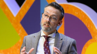
Professor Lee Elliot Major said while the scorecard is internal facing: “What we were hoping…is they would be able to use it as an external facing document to say ‘look this is how we assess ourselves on equity or inclusion’.
“I suppose we were trying to counterbalance all the very strong accountability measures that are out there with something that’s a bit more empowering.”
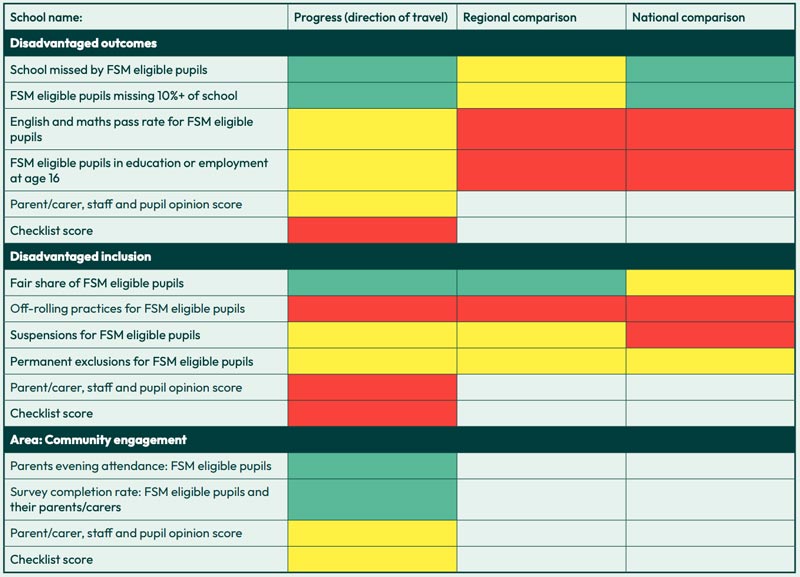
The checklists rely on schools being honest about their provision.
“We are trusting them as professional people, but you can’t lie with the data element,” said Elliot Major.
Six schools in Education South West trialled the scorecard.
“School leaders tend to have a moral imperative to be wanting to support all young people and to lift them up, and therefore playing games, what’s the point?” said director of education Suzannah Wharf said.
Leicester has worked with schools to create an annual audit of their whole school provision. Its ‘best endeavours and reasonable adjustments’ (BERA) framework helps schools know what they must do to meet the needs of pupils with SEND.
Parents can use it to understand if reasonable adjustments should be in place and support them to challenge schools.
Schools then audit themselves on measures such as the leadership and management, inclusive teaching and SEND policies.
However, “It shouldn’t be about them getting ‘a grade’. It’s about having a really good understanding of inclusive practice, and the importance of working in partnership,” Jessica Nicholls, head of service in SEND support services said.
The Department for Education did not provide any further detail on what it was considering this week.
But Jonny Uttley, visiting fellow at the Centre for Young Lives, said while available “inclusion” measurement tools are “imperfect”, they “attempt to do something that DfE hasn’t done in the last 15 years”.
How do we measure inclusion? Experts have their say…
Ofsted’s new framework places a greater emphasis on inclusion. But the change has prompted an important debate about how inclusion can truly be measured.
Ahead of The Difference’s IncludEd conference in January, speakers reflect on how they witness inclusion being measured in schools.
Kiran Gill, CEO of The Difference
Through ‘lost learning’: a window into who’s struggling
Inclusion has historically been a ‘fluffy’ word in schools.

Compared to teaching and learning, it was often thought of as a poor cousin in terms of leadership progression and practice. No longer.
Over the past seven years, I’ve been lucky to work with practitioners and researchers across the country, who are getting hard data on elements of inclusion, and using that to drive up standards in schools and – most importantly – the numbers of children staying in class and succeeding in school.
This January, we’re bringing those colleagues together to share how to do rigorous inclusion work. We can think of this work tying together through what we at The Difference call the ‘Lost Learning Continuum’.
The theory (and research) behind the continuum, is that we can measure whether we’re getting better at inclusion by – literally – whether more or fewer children are included in lessons and the school day. Every piece of data we have on who isn’t – who is instead ‘losing learning’ – is data which can shed light on priorities for school improvement.
Lost learning data is a window into children who most need inclusion. Ofsted’s new approach to inclusion widens a definition from special educational needs to name young people on pupil premium, those historically known to social services and those with protected characteristics.
Our lost learning research found these groups are out of the classroom in many ways, at really disproportionate rates.
But as much as grouping young people can help us, it can also hinder inclusion: we can end up creating systems to support the children whose needs we know about and miss those we don’t.
And that’s where the lost learning continuum is helpful, because it shows us, regardless of what category they’re officially in, which children are struggling the most to stay in school.
Jeremy Dodd, Head, The Avenue Centre for Education, Luton
Through internal truancy
There was a time when, confronted with a question in class he didn’t know the answer to, Freddie* would – without drama – get up and walk out.

Across the country, teachers have reported an increase in internal truancy since the pandemic. Teacher Tapp found 95 per cent of secondary schools are concerned about children coming into school but not into lessons.
Like APs across the country, we serve many pupils who have experienced significant personal adversity, followed by permanent exclusion or managed moves.
Our role is to help them re-engage with education and believe they can succeed.
We used the Lost Learning continuum to look at earlier signs that students were still feeling disengaged. We found that Freddie wasn’t an outlier. We set an ambition to reduce internal truancy by 50 per cent.
We started with better measurement: tracking internal truancy consistently via issued ‘workslips’ recorded in Arbor for anyone leaving the class as part of an emotional management strategy, and making sure there were lesson registers rather than just AM and PM registers.
This helped us diagnose challenges in the school day or week – like anxiety over the PSHE curriculum – and identify pupils we wanted to do voice exercises to unpick the drivers of this ‘self-exclusion’.
From there we developed strategies. We increased pupil accountability with daily ‘catch-up’ time after school for students who’d lost learning.
We re-worked our PSHE curriculum and, after hearing pupil voice anxieties about asking for help in front of peers, we developed universal staff training on assessment for learning, alongside improving the sharing of strategies effective for certain pupils, like Freddie.
There’s still work ahead but attendance rose for us that year, and internal truancy fell by 52 per cent. And Freddie? He’s stopped walking out of lessons.
Prof Neil Humphrey, professor of psychology Manchester University and Caz Brasenell, executive principal at Ark Kings Academy
Through room removal
Room removal can be an important tool to keep classrooms calm and everyone learning.

But if we don’t track it, it’s hard to understand its prevalence, impact (on learning for those removed) and whether what we do during room removal addresses the underlying challenge that led to removals in the first place.
Neil has been setting out to answer these first two questions, with colleagues from the University of Manchester, who surveyed 34,000 pupils at 121 mainstream schools across Greater Manchester.
“When we looked at ‘who is losing learning’ we found similarities with children suspended or persistently absent: children with special needs and free school meals were more likely to report being in internal exclusion.”
The dataset also showed internally excluded pupils “reported lower school belonging, weaker relationships with teachers, and (for girls) poorer mental wellbeing than their closely matched, non-excluded peers”.
Meanwhile, Caz has been tackling this third question with her team at Ark Kings: how do we address the root causes of room removal and reduce repeat incidents?
In tracking data, “we can target further intervention (like our two-week programme to understand barriers to lesson engagement, or in-school counselling) and when intervention successfully reduces repeated room removal”.
Jess Easton, Director of The Engagement Platform and Mia Cohen, executive assistant to the CEO at The Difference
Through student engagement
One day Oliver* was mugged outside his school. It was only one day, but after that he didn’t go to school for six months. He just didn’t feel safe anymore. Today we’d call him ‘severely absent’.

This link between sense of safety and engagement in school can be seen clearly in the data. The Engagement Platform (TEP) has captured surveys of student engagement across 100,000 young people.
Recent analysis showed one in three children felt unsafe (scoring their safety at a 5/10 or lower).
Safety is one component in Professor John Jerrim’s conceptualisation of engagement, used in TEP, which includes belonging, enjoyment and relationships.
The data shows a dramatic fall in enjoyment, trust, safety and belonging when pupils move from year 6 to year 7.
ImpactEd’s evaluation supports this – indicating low sense of safety, wellbeing and belonging are associated with higher levels of absence and suspension.
Used formatively the data can be transformative. School leaders don’t always know about those harms happening outside the school gates.
Engagement data is the canary in the coal mine, and once we can know which groups of young people are experiencing a drop in engagement (year 7 girls, for example) we can begin listening exercises to identify drivers in school and make adjustments.
John Pickett, Headteacher at Morpeth School, with research from Public First’s Dr Sally Burtonshaw
Through ‘bullying’ data
When our students were joining the dots with their own experiences and international events like the murders of George Floyd, Sarah Everard and Brianna Ghey, we might have been tempted to respond to rising disclosures of discrimination as pastoral issues.

They could have been dealt with in siloes by heads of year, repairing specific relationships between groups of students. Instead, we decided to lean into the uncomfortable listening and deliver a more strategic response.
Ofsted’s new approach to inclusion spells out that some children might have lower wellbeing linked to their protected characteristics, including experiences of racism.
We decided to take the same approach we take to improving our teaching and learning: start with data.
We surveyed pupils, interviewed them, and interrogated performance, behaviour, exclusion and absence data.
Key was improving our bullying data. We realised coding with the blanket term ‘bullying’ was unhelpful. We began breaking down types of harm, including discriminatory harm that was misogynist, racist or homo/transphobic.
As we listened, young people disclosed more. Bullying data worsened, which was positive – fewer young people keeping discrimination to themselves, as we saw many children do in Ofsted’s 2021 review into misogyny.
There’s work ahead – this type of continuous improvement is constant – but we’re pleased with the progress to date. And the bullying data is now falling, suggesting our work is having an impact on inclusion.



Your thoughts