GCSE results are out.
Each year Ofqual produces boring-sounding variability charts. It’s a dull name, but very important data.
These charts show how many centres, i.e. schools or colleges, dropped or increased their results compared with the previous year.
This means that if you dropped, say, 25 per cent in one subject, you can see how many other schools also saw the same dip.
GCSE English: A picture of stability
DO NOT PANIC. These look complicated, but they’re not.
First, look at the green chart. It represents this year’s English language results, and it covers just 16-year-olds.
Each bar represents a change in pass rate of 2.5 percentage points.
So, at the far left, you can see a tiny little bar at the -50.0 range. This means a couple of schools have seen their English language scores plummet by 50 percentage points. You can tell how many schools dropped or increased by reading across to the axis on the left.
In the middle, you can see just over 200 schools had their English language scores move by 0 to 2.5 percentage points.
The blue chart represents movement last year.
We can see last year that more than 300 schools saw their results move by between 0 and -2.5 percentage points.
The fact the green chart is flatter and much broader on the left-hand side suggests more schools this year have seen their scores drop and many more have seen them drop by 25 percentage points or more.
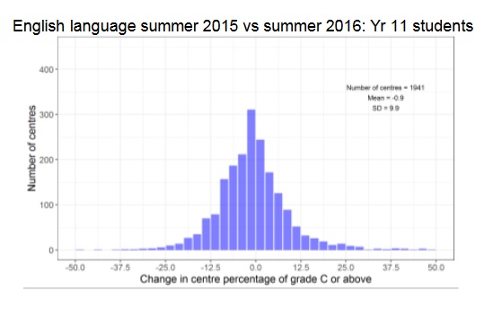
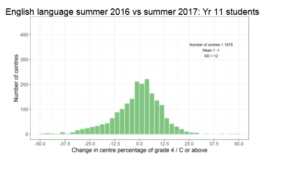
The exam boards have said this is because more pupils with low prior attainment have been entered for the exam, which has brought the proportions getting a C/4 or above down.
English literature
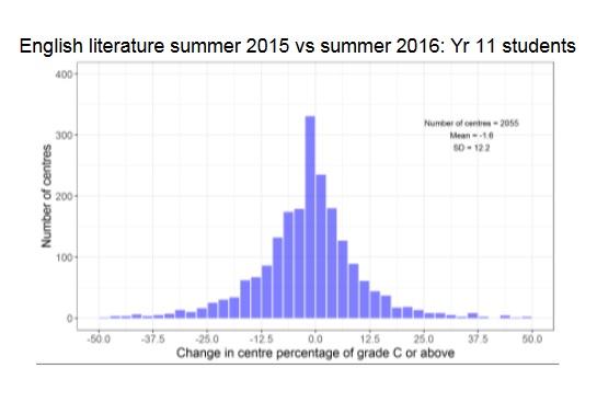
In English literature, the picture is very similar to last year. There are far fewer changes here. One thing noticeable this year (green chart) to last (blue chart) is fewer schools leaping upwards by 30 percentage points or more.
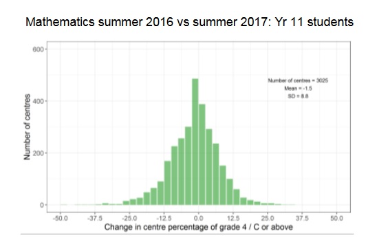
GCSE Maths: No surprises
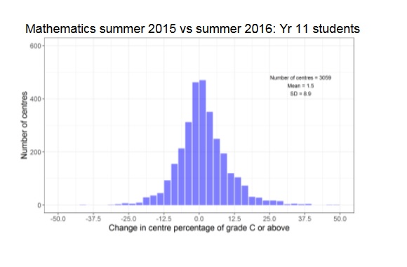
Overall the picture is again similar. Slightly more schools dropped by a small amount than increased, so the overall trend is a touch down. But nothing dramatic.
GCSE Science: Hmm
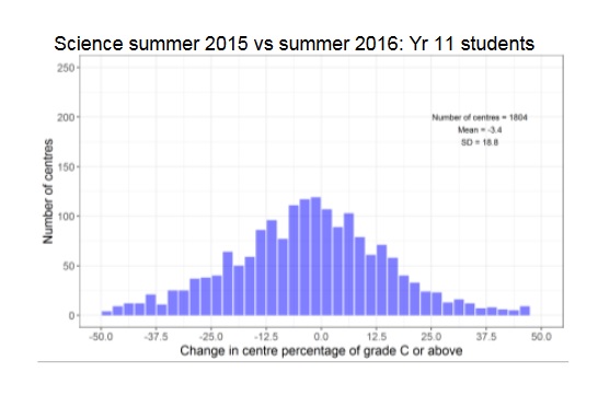
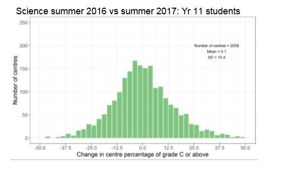
Compared with last year, things are more even, but Science does tend to move about more than English and maths. There are lots of hypotheses about why this should be, but it is worth bearing in mind that if you oversee a science department that bigger variations in your data year-to-year are expected compared to other core subjects.
Overall, there’s no trend downwards, but the spread of the changes is much bigger. On the one hand, this is good, as it means it’s more likely you’ll make huge jumps upwards, but also huge falls also happen.
In conclusion?
Compared with a few years ago, this is a much more stable picture. It only looks at C/4s and above, so it is blunt. If your focus is on 5s or As for example, it doesn’t help.
But it does show that exam regulation is pretty much working how it was supposed to eventually. Dull for headlines, but good for schools.


Your thoughts