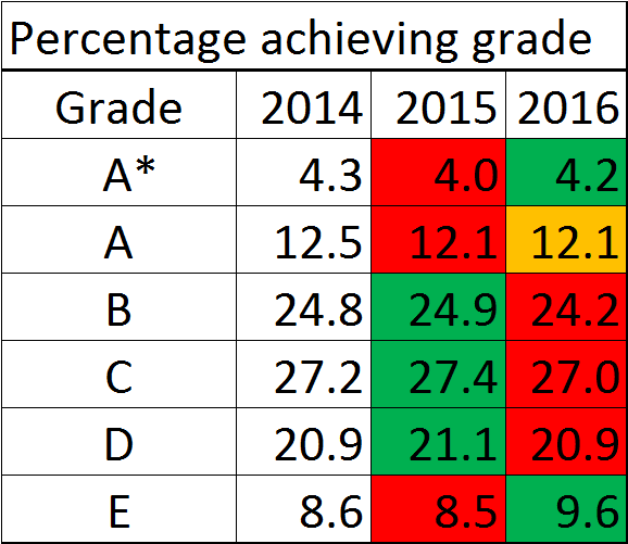
Design and technology A-level results for 2016, compared to previous years
Design and technology A-level results for 2016, compared to previous years: cumulative
Percentage of pupils who achieved (at least) each grade
Key
Green: Higher than previous year
Orange: Same as previous year
Red: Lower than previous year


The first thing to remember is that exam percentages are predetermined statistically with very little change allowed each year so we can draw little from these statistics. When all of the marks are totalled you should get a bell shaped curve. If an awarding organisation has determined that 16% of candidates will be awarded an A grade the final decision will depend on where the students fit in that curve. The distribution of marks is not always smooth and in single mark steps so it might be the case that 16.2% is the best fit to the statistically recommended boundary. The next step up or down might skew the statistics unacceptably, making it 15% or 18%. Having sat on numerous awarding committees this can be a frustrating experience where the evidence of real standards as we would perhaps agree might not actually match the marks and grades which are being manipulated by statisticians. Add to that the inconsistencies in marking and the allowed tolerance between markers and what you have is rather similar to the lottery, with winners and losers which are often a mystery to teachers. It staggers me how few schools actually challenge the results each year.